Starting a new User Interface (UI) design project can feel overwhelming. You may receive hundreds of pages of specifications, including project and creative briefs, build requirements, draft wireframes, app flow ideas, examples of existing products, and detailed brand guidelines.
Somewhere within all of that is a clear product waiting to be designed.
So where do you begin?
(Updated Sep 2022)
Getting the Budget Right
Before any pixels are pushed, there’s the matter of defining scope and cost. Reaching this stage often takes hours — speaking with the client, researching the product space, and waiting for all necessary information to come together — before you can confidently evaluate the project and prepare an accurate quote.
How do you price something as comprehensive as a large-scale UI design and style guide production project?
I’ve found that an hourly rate model works best for complex UI/UX projects. While some clients are comfortable with time-based billing, most prefer a projected total before giving approval.
My approach is structured: once I have all documentation, I review each deliverable individually and estimate the time required in both best- and worst-case scenarios. This creates a realistic range rather than a fixed guess. If applicable, I also factor in money transfer and currency conversion fees.
The result is a budget range that can be discussed transparently. If feedback cycles are efficient and revisions minimal, the project trends toward the lower end of the estimate — and vice versa.
Deadlines and availability also influence pricing. To maintain clarity and momentum, I typically structure payments across four phases:
- Research, ideas, and sketching
- Wireframes and workflow design
- UI/UX design and visual refinement
- UI style guide documentation
You’ve Got the Go Ahead
The contract is signed. The brief is approved. Now you’re facing a blank canvas.
Where do you start?
Plan Ahead
I begin by creating a structured contents page outlining every agreed design component. This becomes both a roadmap and a progress tracker — for me, the client, and the development team.
Large UI style guide documents can quickly become overwhelming. Breaking them into clear, manageable sections creates milestones that make progress measurable and collaborative.
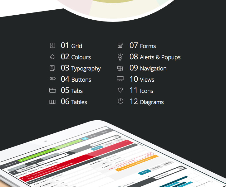
UI Style Guide Contents
Start With the Basics
Every scalable interface begins with structure.
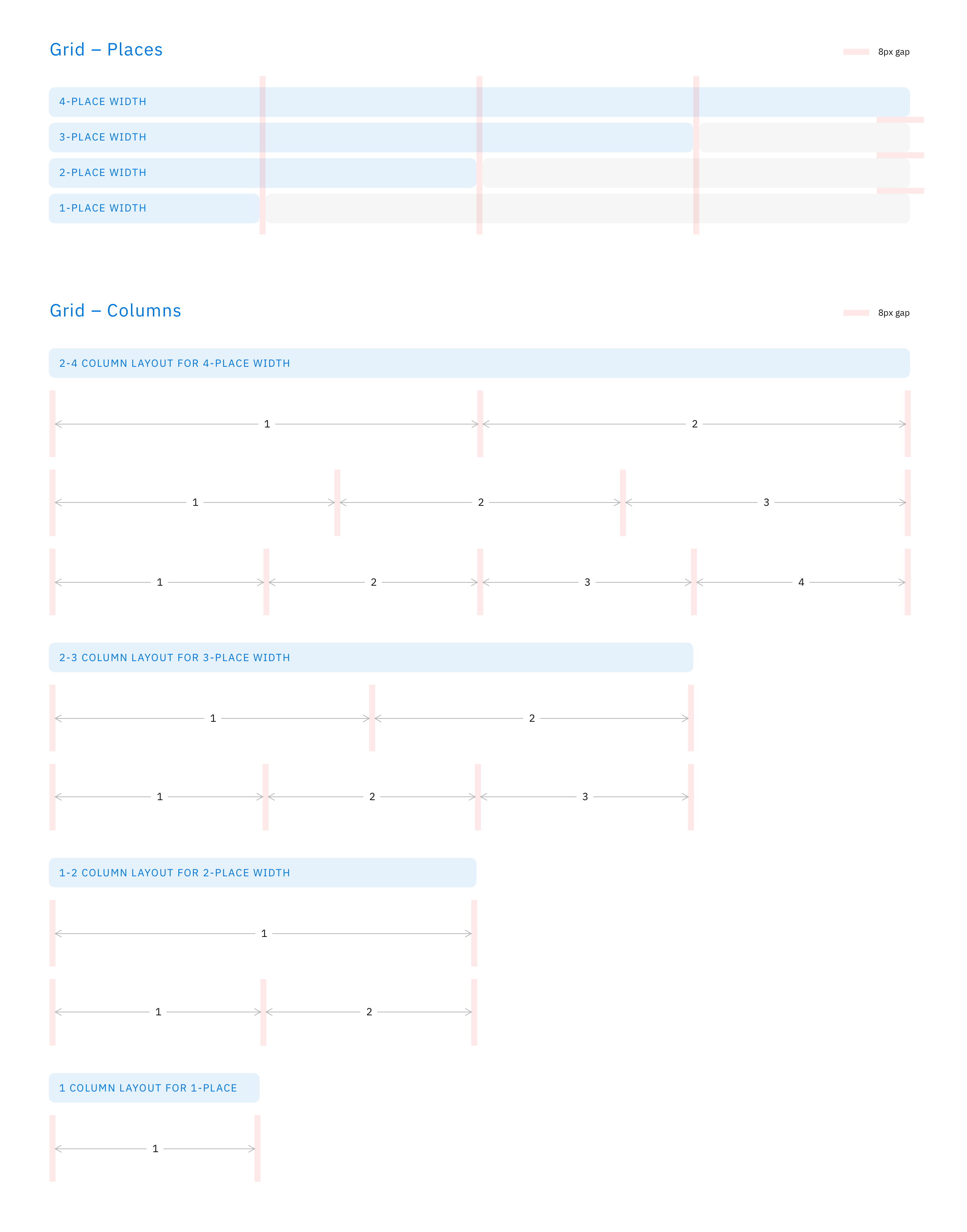
Establishing a grid system early ensures visual consistency across all UI elements. More importantly, the grid must be flexible and scalable. If it isn’t, you’ll likely need to revisit and adjust it later — which inevitably affects the interface design.
The grid must also respect the technical and brand constraints defined in the brief.
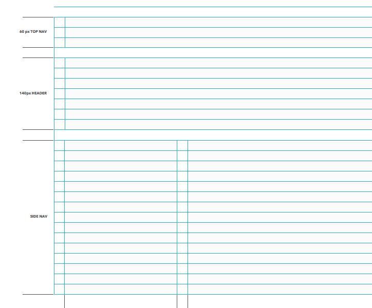
UI Grid Design
The same principle applies to the typography baseline grid. Strong typographic rhythm improves clarity, hierarchy, and usability.
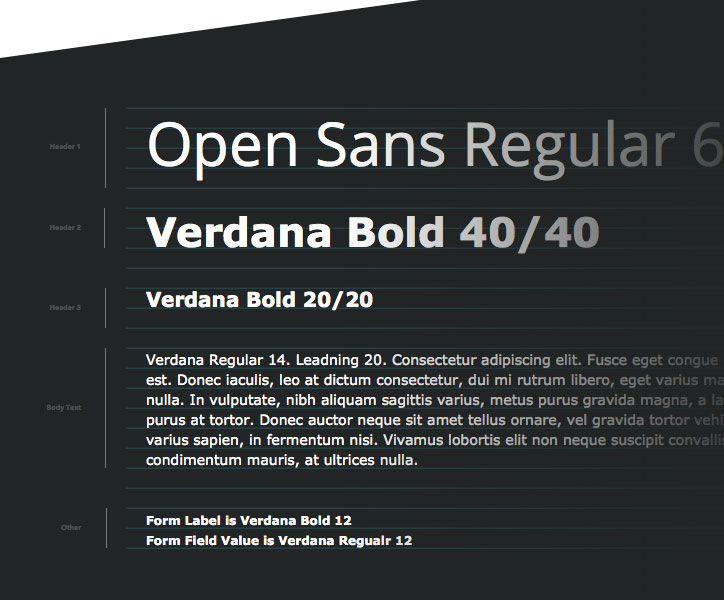
UI Typography Design
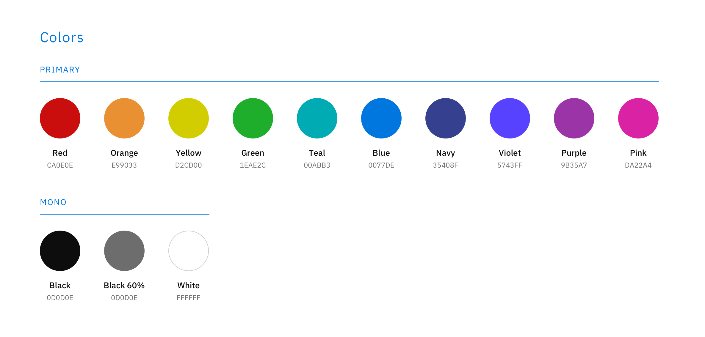
Next comes colour. Developing an initial UI colour palette based on the brand brief dramatically accelerates visual exploration. At this stage, the palette intentionally includes more colours than will remain in the final system — often 10–15 shades of blues or greys — ensuring sufficient contrast and accessibility across interface states.
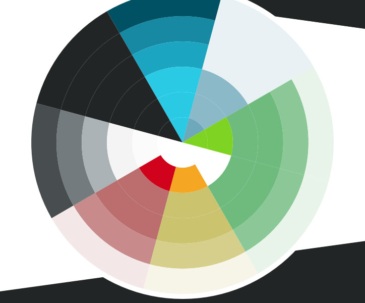
UI Colour Wheel Design
Continue With the Essentials
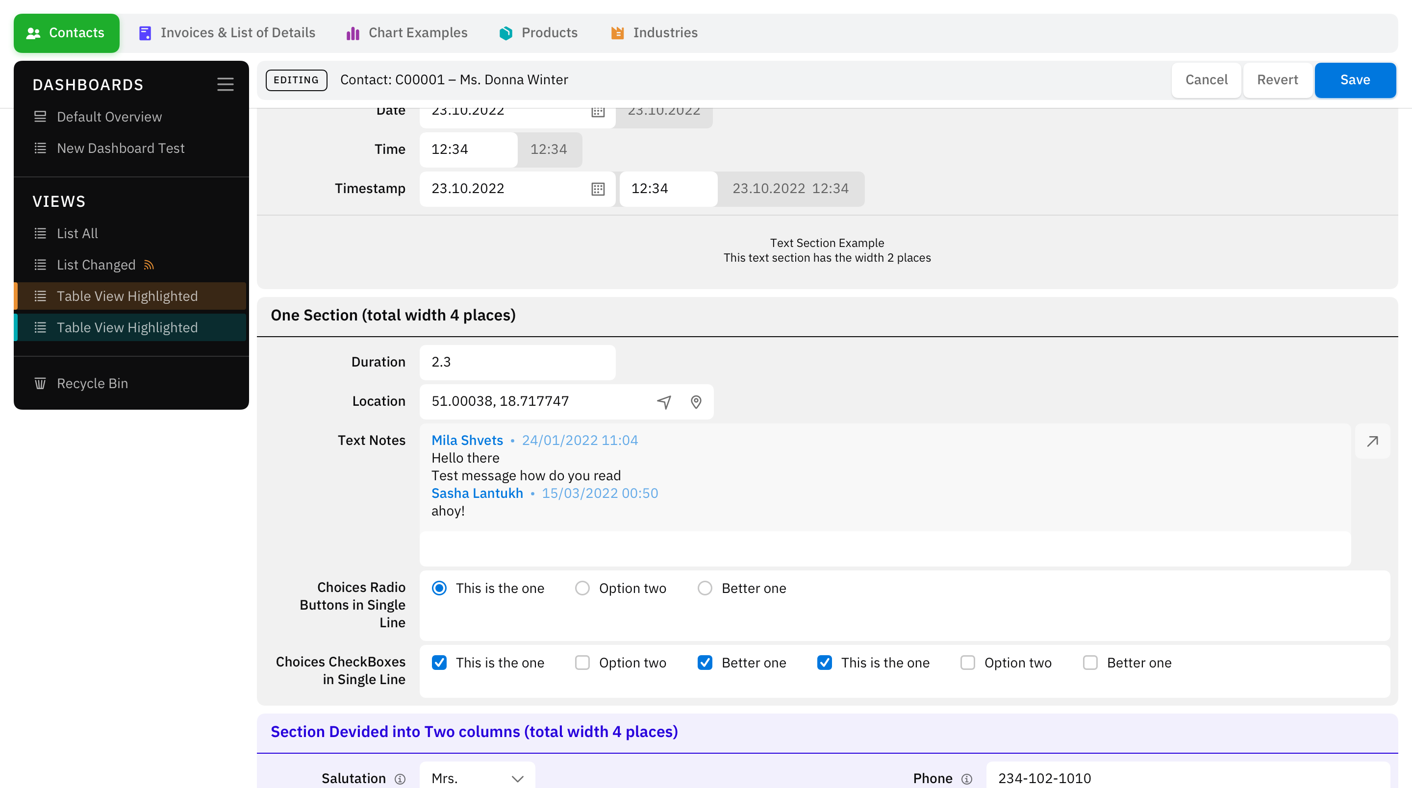
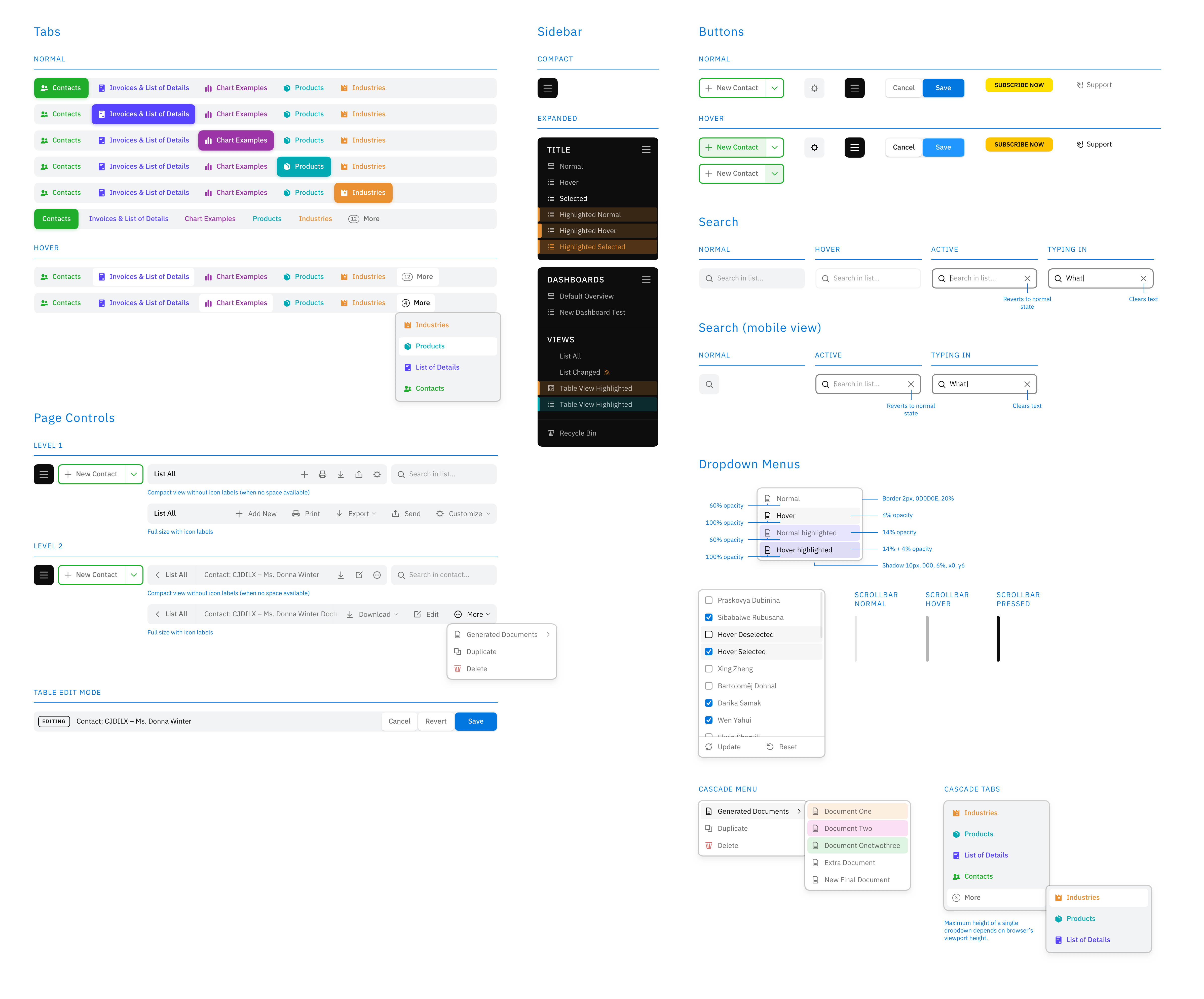
Once structure, typography, and colour are defined, the UI system begins to take shape. From here, it’s about methodically designing components — buttons, form fields, navigation, tables — and refining them through iterative feedback.
Progress becomes rhythmic: design, review, refine.
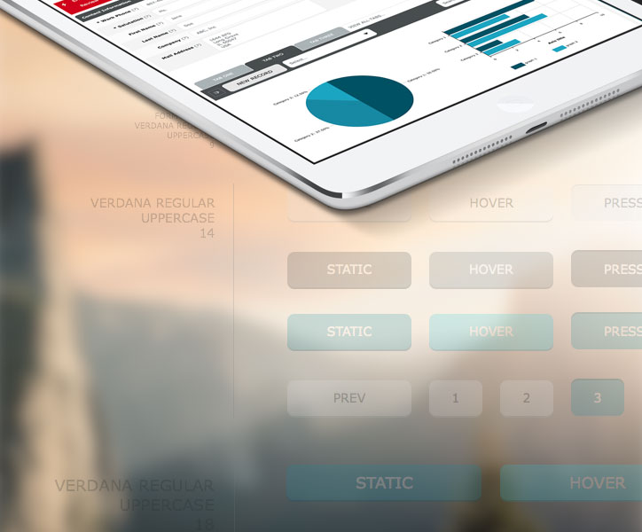
UI Buttons Design
Test, Update, and Revise
With components in place and screens assembled, the focus shifts to validating user flow and experience. A beautiful interface is meaningless if it doesn’t function intuitively.
This phase requires structured testing and multiple revision cycles. Usability always reveals something worth improving.
You can read my article, Sketch & InVision Apps Workflow Tips for the UI/UX Design Process (coming soon!), on accelerating this final stage using Sketch and InVision.
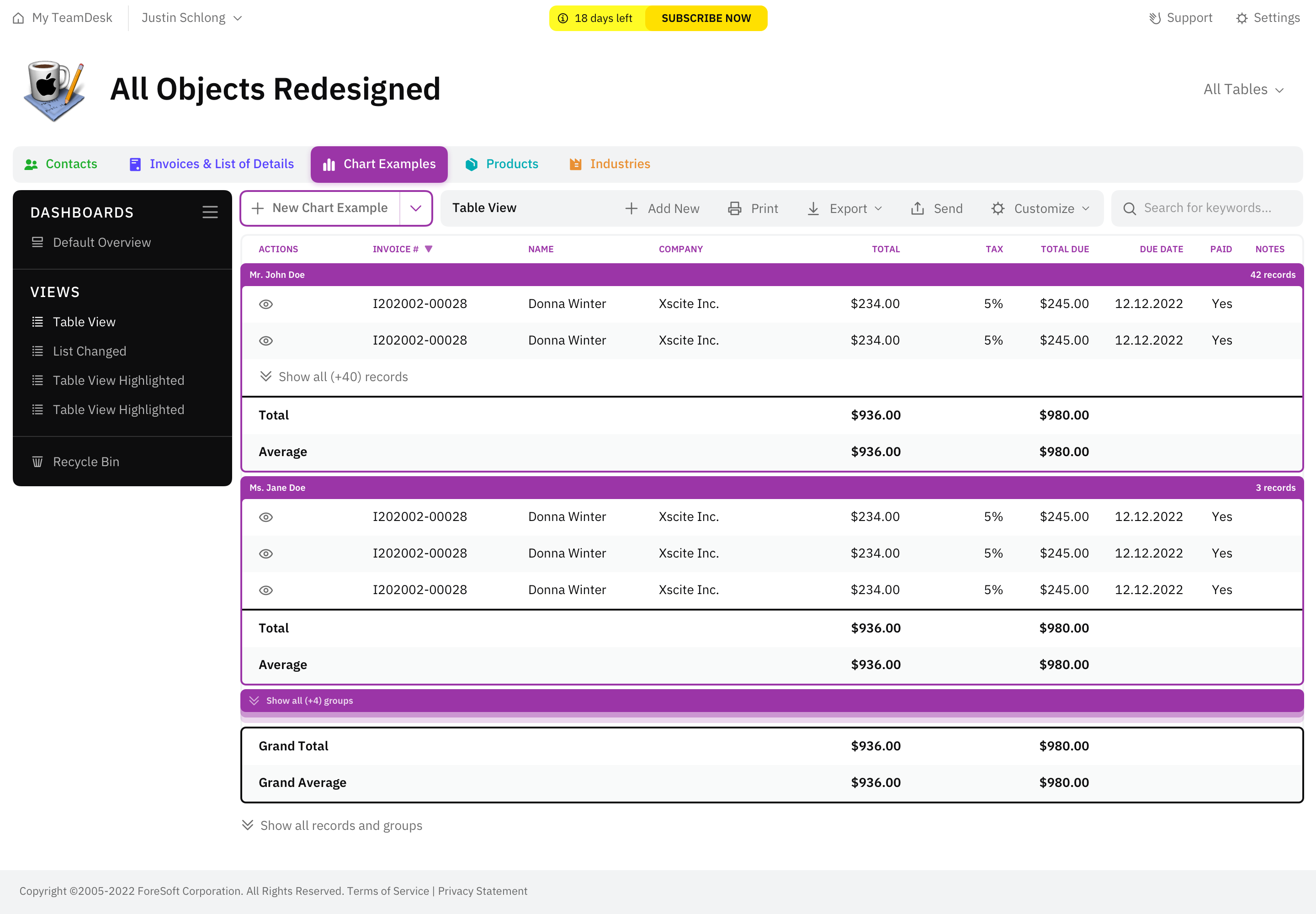
As I begin assembling the final UI style guide document, I revisit the entire system — refining the colour palette and consolidating UI elements to ensure the minimal necessary number of styles. Simplification at this stage strengthens long-term scalability.
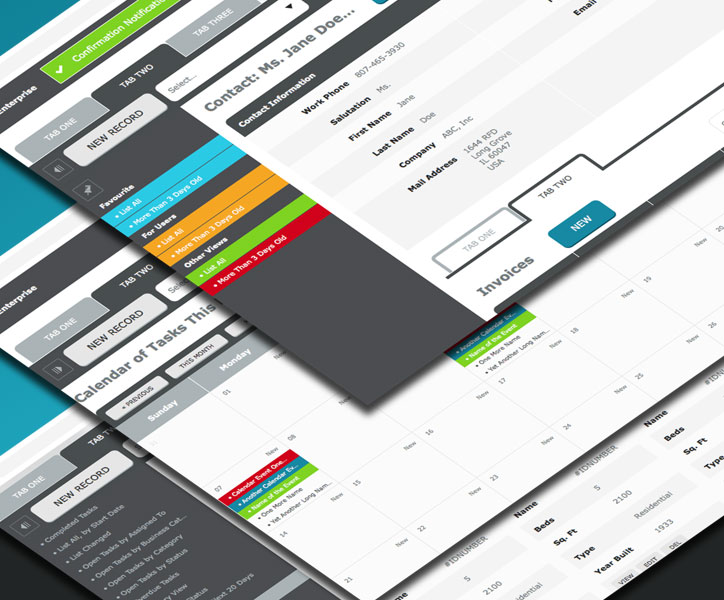
UI Screen Views Examples Design
Conclusion
A successful user interface design does more than meet the brief. It solves real user problems while balancing brand, usability, and technical constraints.
By the end of the project, the UI should be:
- Clear
- Concise
- Familiar
- Consistent
- Attractive
- Efficient
These principles continue to guide my approach to product and interface design today.
Please feel free to leave comments or questions below.
Screenshots shown are from the TeamDesk UI design project, which you can explore in full on Behance. A 2022 UI refresh followed this initial release.
2022 Update
Eight years later, our team designed a second version of the TeamDesk UI web application. A detailed case study will be available soon. This version was completed as part of the Studio SS partnership.