Sasha Lantukh
14. Colour Needs Context
The Ugliest Colour in the World Is Also the Mona Lisa
June 12, 2026
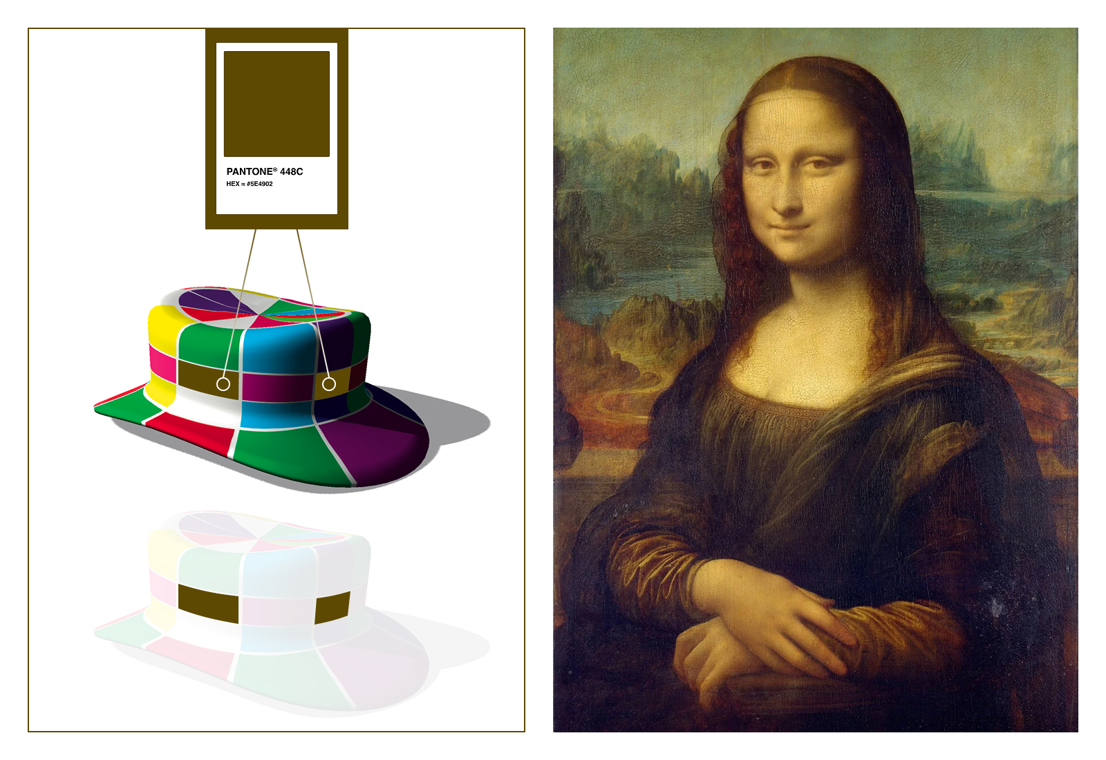
Joseph’s hat illusion (Donald D. Hoffman, The Case Against Reality) and Leonardo da Vinci, Mona Lisa
As a designer, I’ve heard it countless times.
“I hate that colour.”
“Red and green don’t work together.” (Unless it’s Christmas).
“Brown is depressing.” (Unless it’s supposed to be gold).
Yet Pantone 448C was literally selected as the ugliest colour in the world, while colours remarkably close to it help form one of the most celebrated paintings ever created.
If someone challenged us to design a masterpiece using the world’s ugliest colour, many of us would immediately start generating reasons why it couldn’t be done. The colour is wrong. The client’s brief is flawed. The odds are stacked against us.
But that’s precisely what makes it interesting.
The challenge reveals an assumption: that beauty lives inside the colour itself.
What if it doesn’t?
What if beauty emerges from relationships instead? From contrast, context, composition, story, expectation, and meaning.
Before we blame the colour itself, consider the image below.
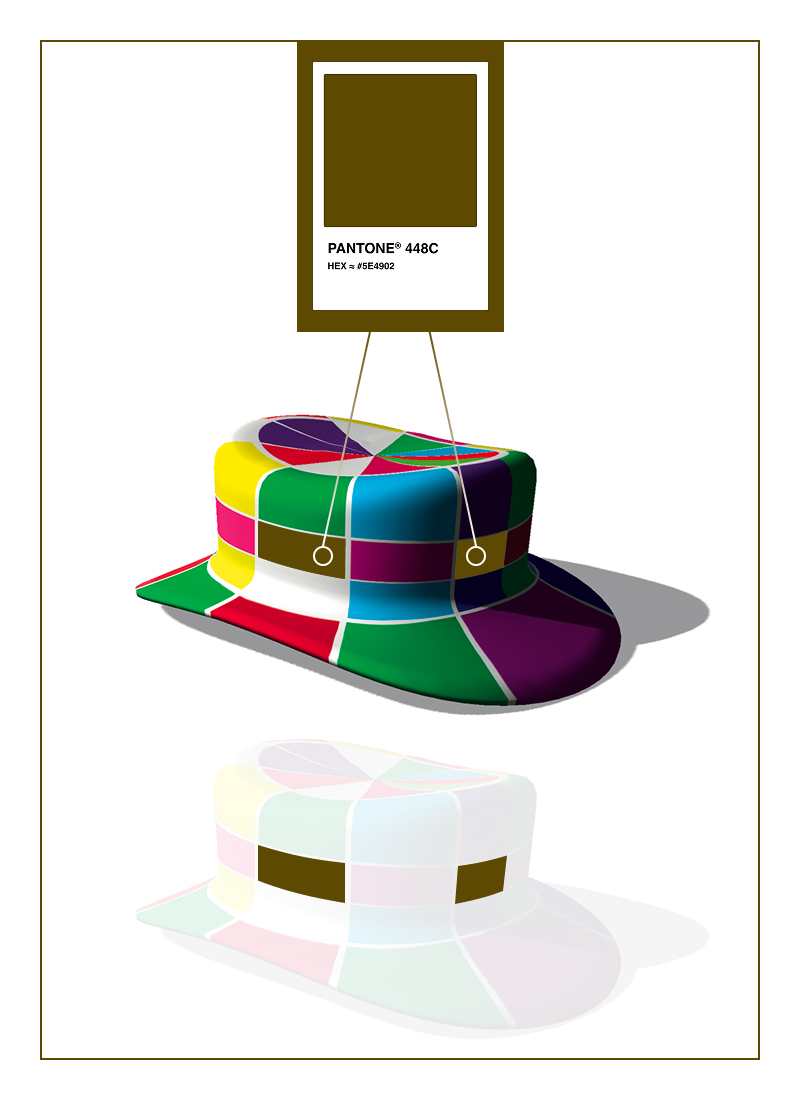
Joseph’s hat illusion. Donald D. Hoffman, The Case Against Reality
In Donald Hoffman’s The Case Against Reality, a simple illustration shows two identical coloured squares. One appears brown (the ugliest colour in the world chosen to deter smokers from cigarette packages), the other — cosy glow yellow. They are, in fact, exactly the same colour. Context somehow changes everything.
Perhaps this extends beyond colour.
We often treat circumstances the same way. This job is wrong. This city is wrong. This limitation is wrong. This situation is ugly.
Sometimes that’s true.
But sometimes we’re looking at the world’s ugliest colour and forgetting that the Mona Lisa was painted with it.
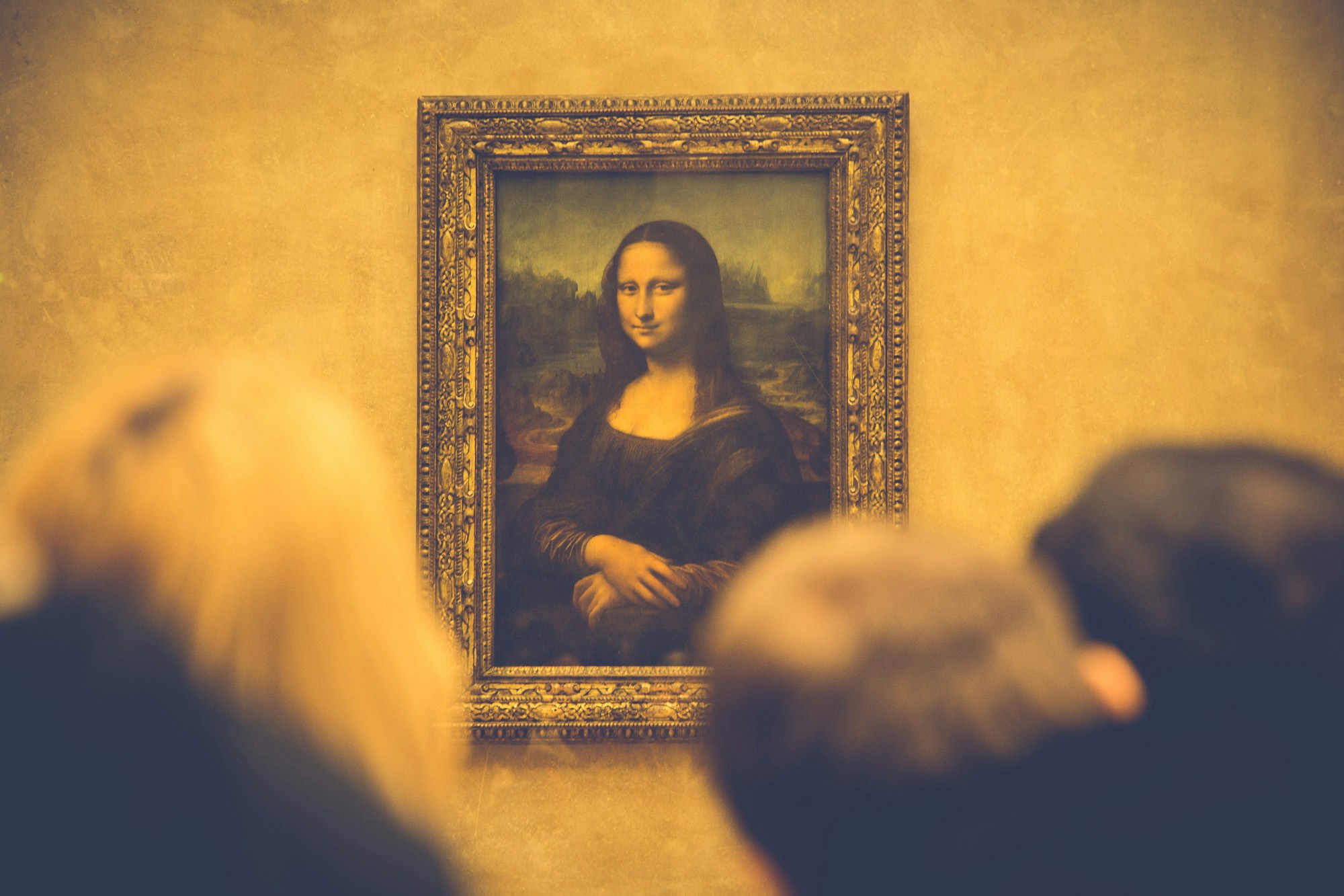
Photo by Eric TERRADE on Unsplash
NEXT UP
Got a project in mind?
Let's chat — book a call, or