

A4 & Letter Publication System for Affinity
Most publication work starts the same way: a blank page, default margins, default styles, and a vague sense that everything will probably need adjusting later.
At first it feels manageable. You choose a font, create a few headings, set up some columns, maybe adjust spacing as you go. But once the document grows — more pages, tables, notes, images, sections — small inconsistencies start multiplying. Spacing drifts. Hierarchy weakens. Alignment becomes harder to control. Eventually the document starts fighting back.
The invisible work of publication design
A lot of that work is invisible. Readers rarely notice a good baseline grid or a consistent typographic rhythm directly. But they absolutely notice when structure feels unclear, dense, or inconsistent. Good publication design often works by removing friction rather than adding decoration.
Why I built a reusable editorial system
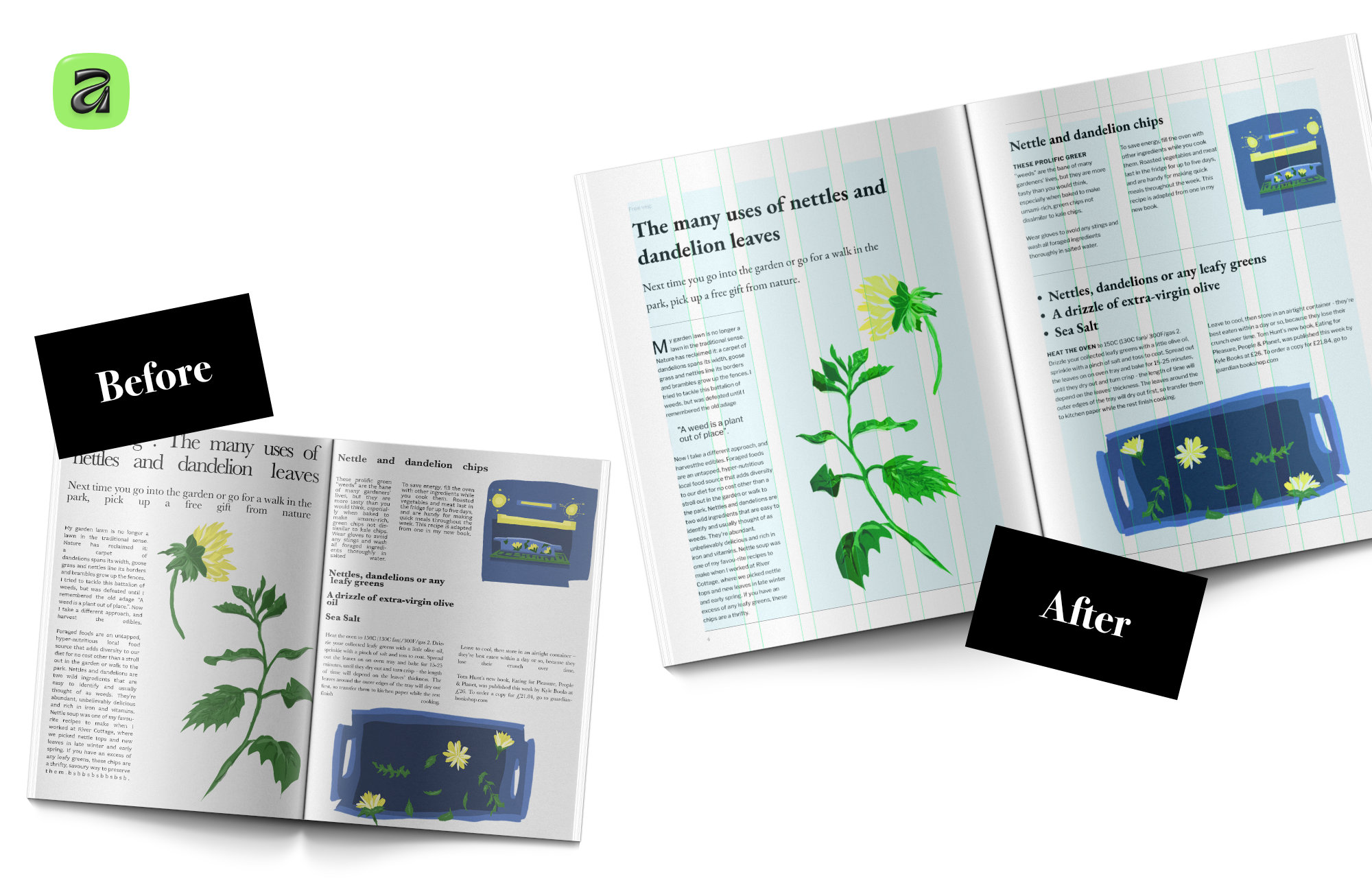
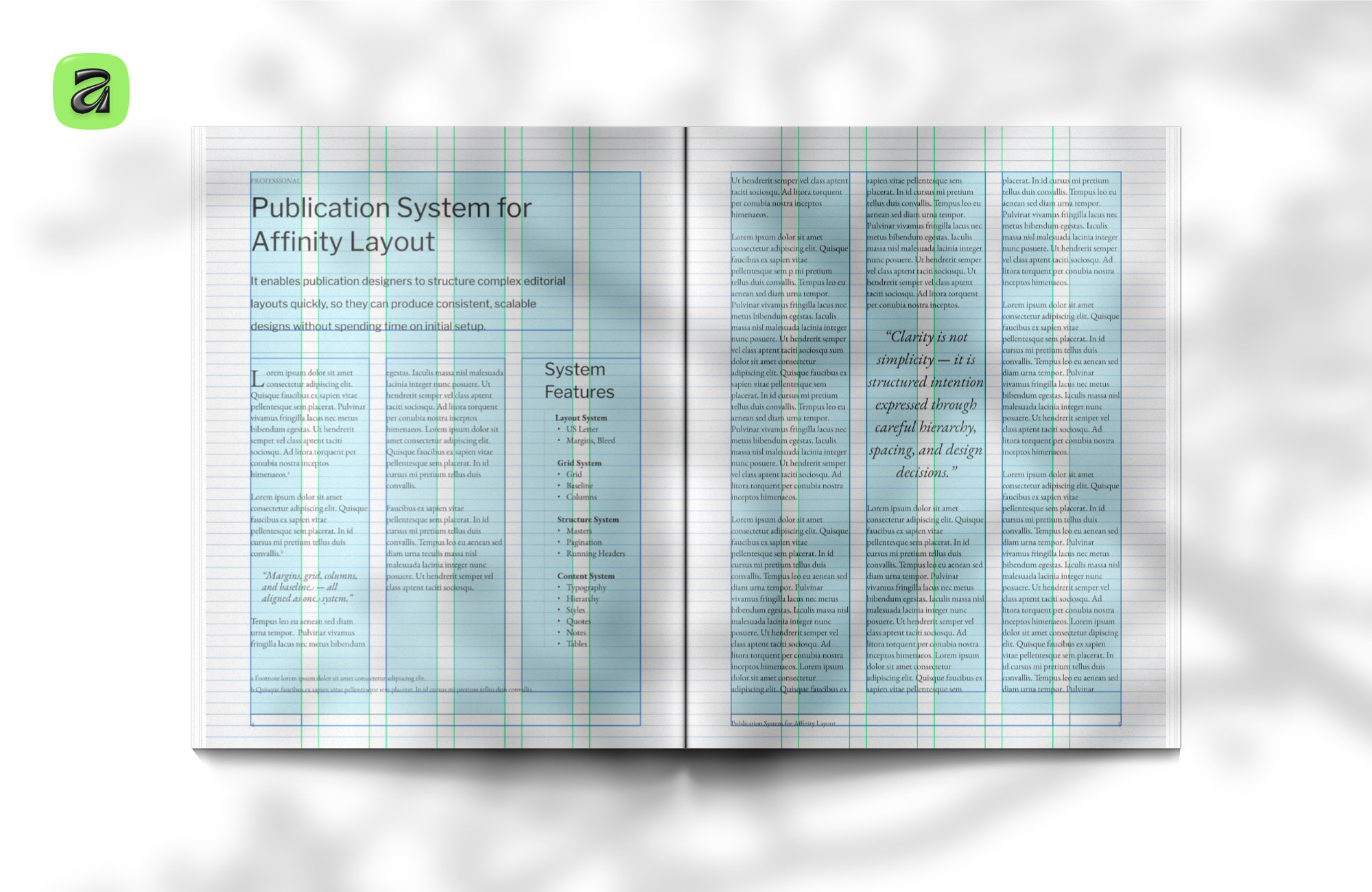
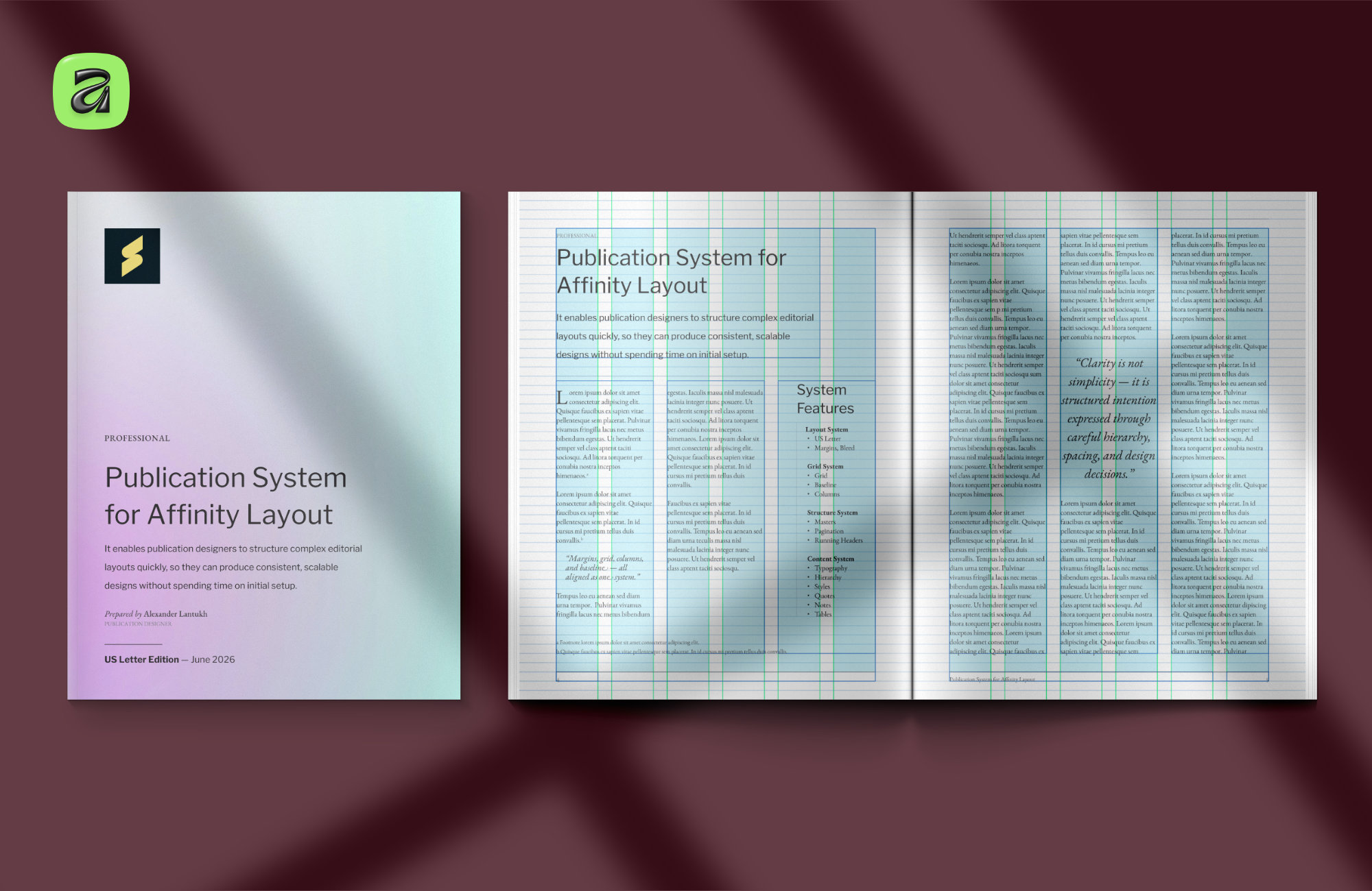
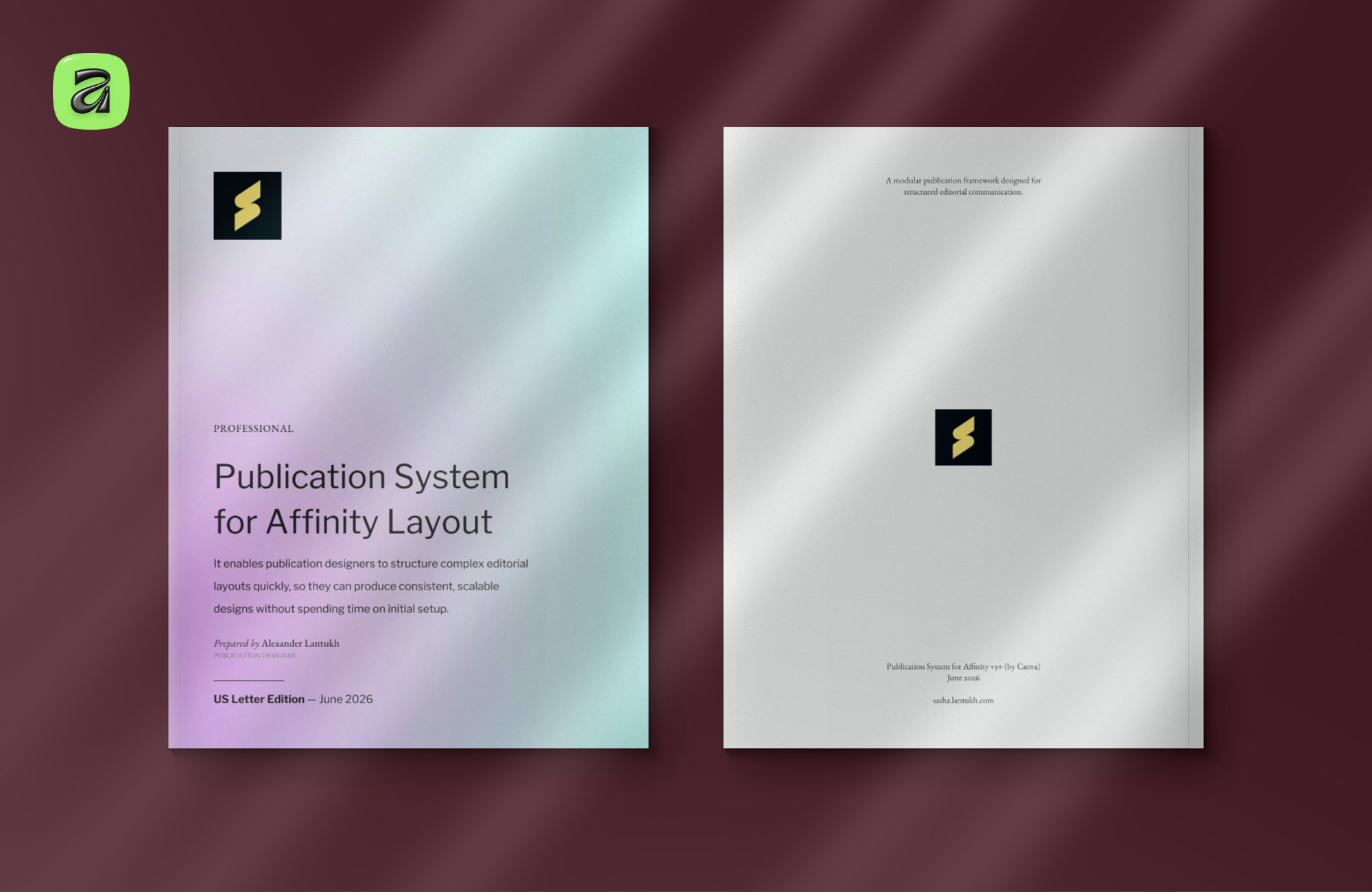
That idea became the basis for the Publication System I recently released for Affinity — available in both A4 and US Letter formats.
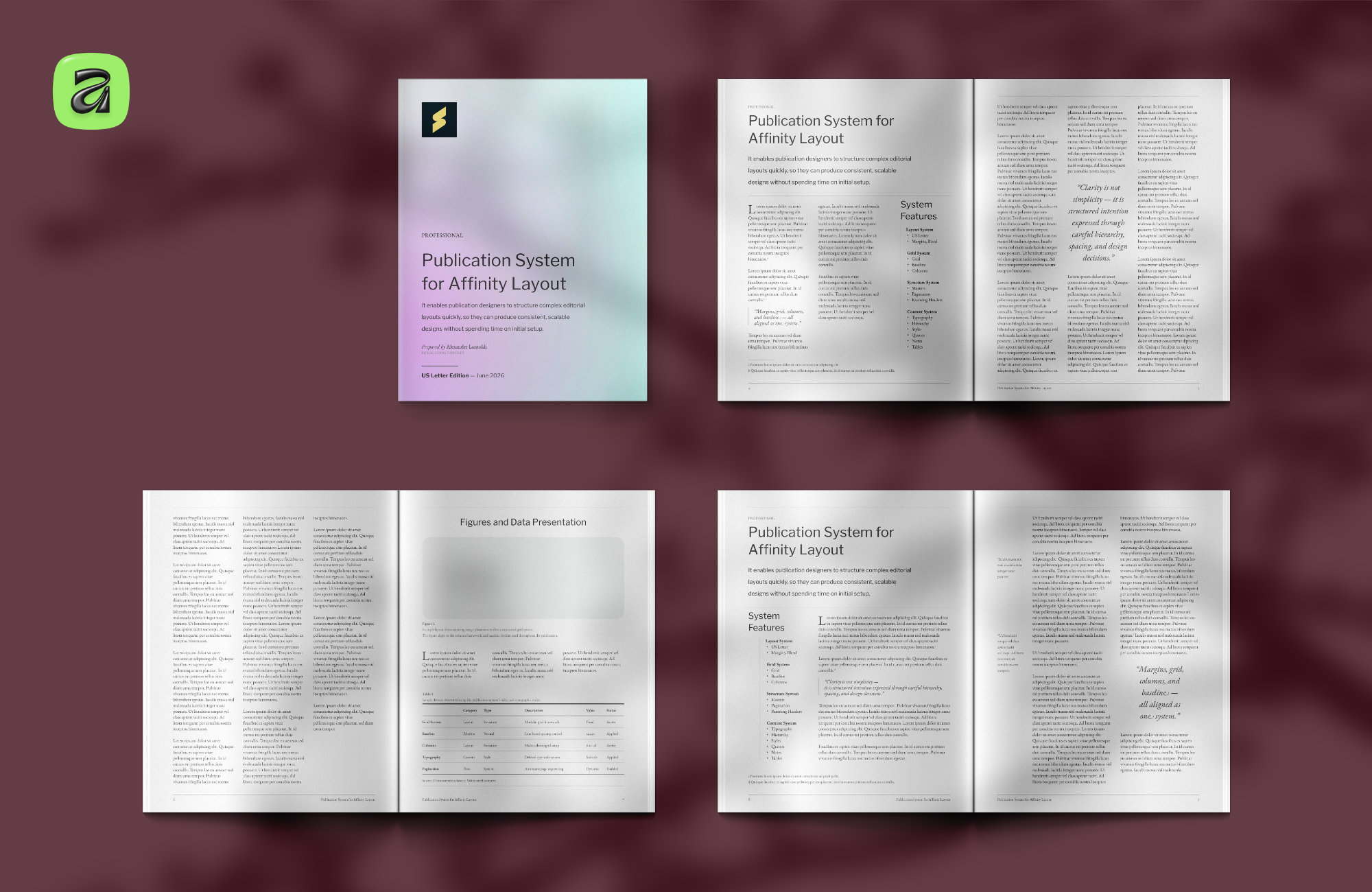
Instead of building a heavily stylised template, I wanted to create something closer to a professional starting point: a structured editorial foundation with margins, grids, typography, master pages, hierarchy, tables, notes, and spacing systems already resolved.
The goal was simple — make it easier to focus on the parts that actually define the publication. The content, typography choices, imagery, and overall tone. Without spending hours rebuilding the underlying structure every time a new document starts.
What the system includes
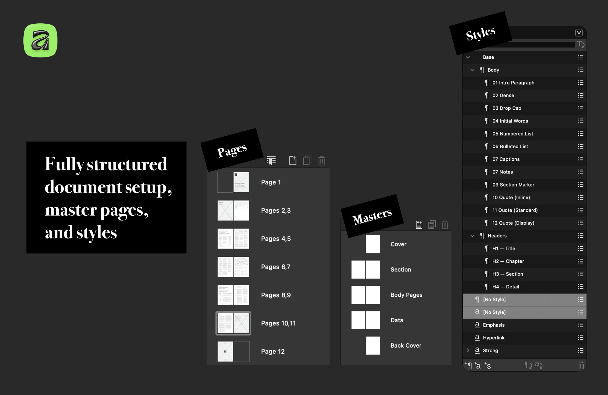
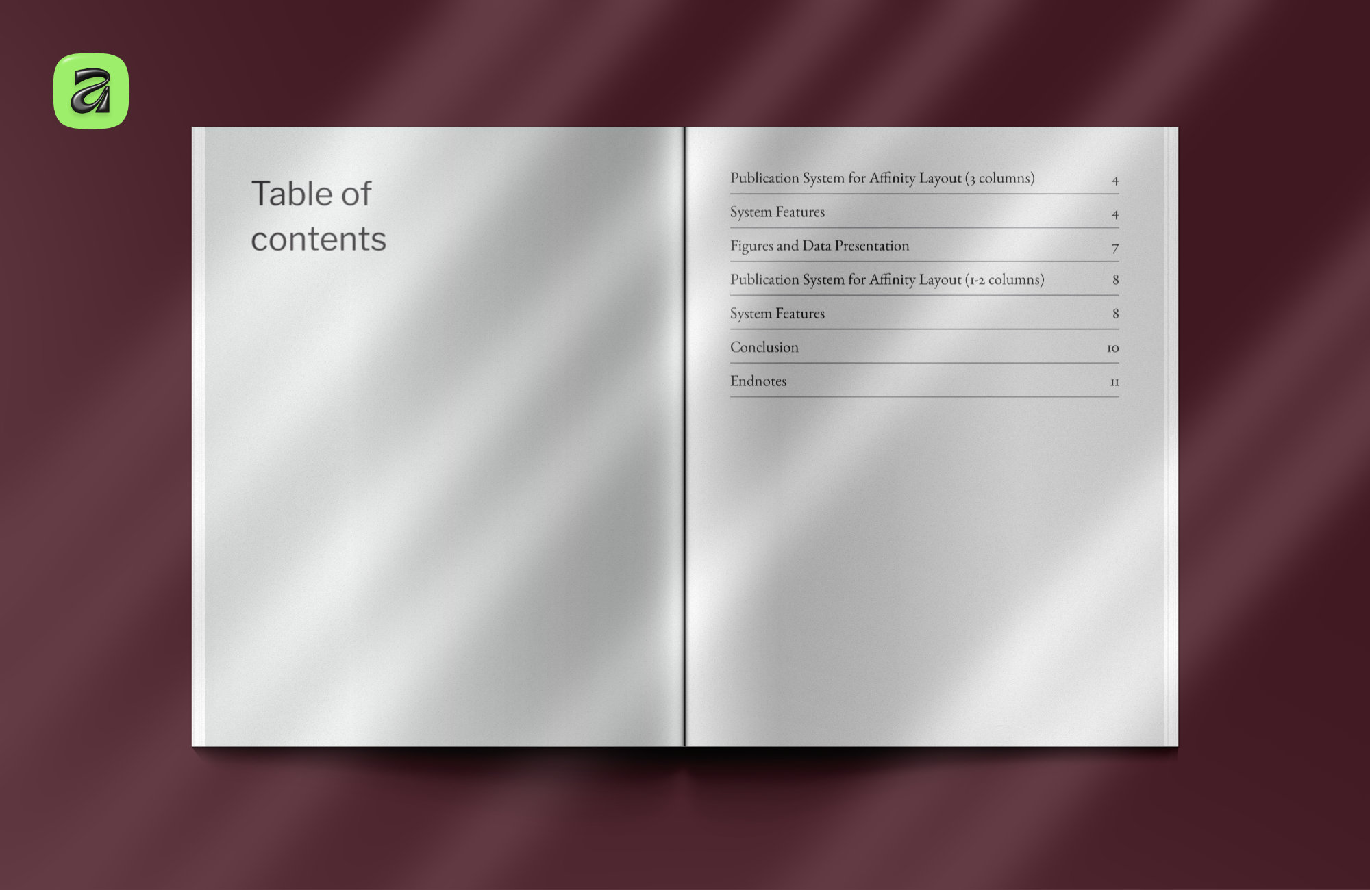
The system covers the full editorial foundation:
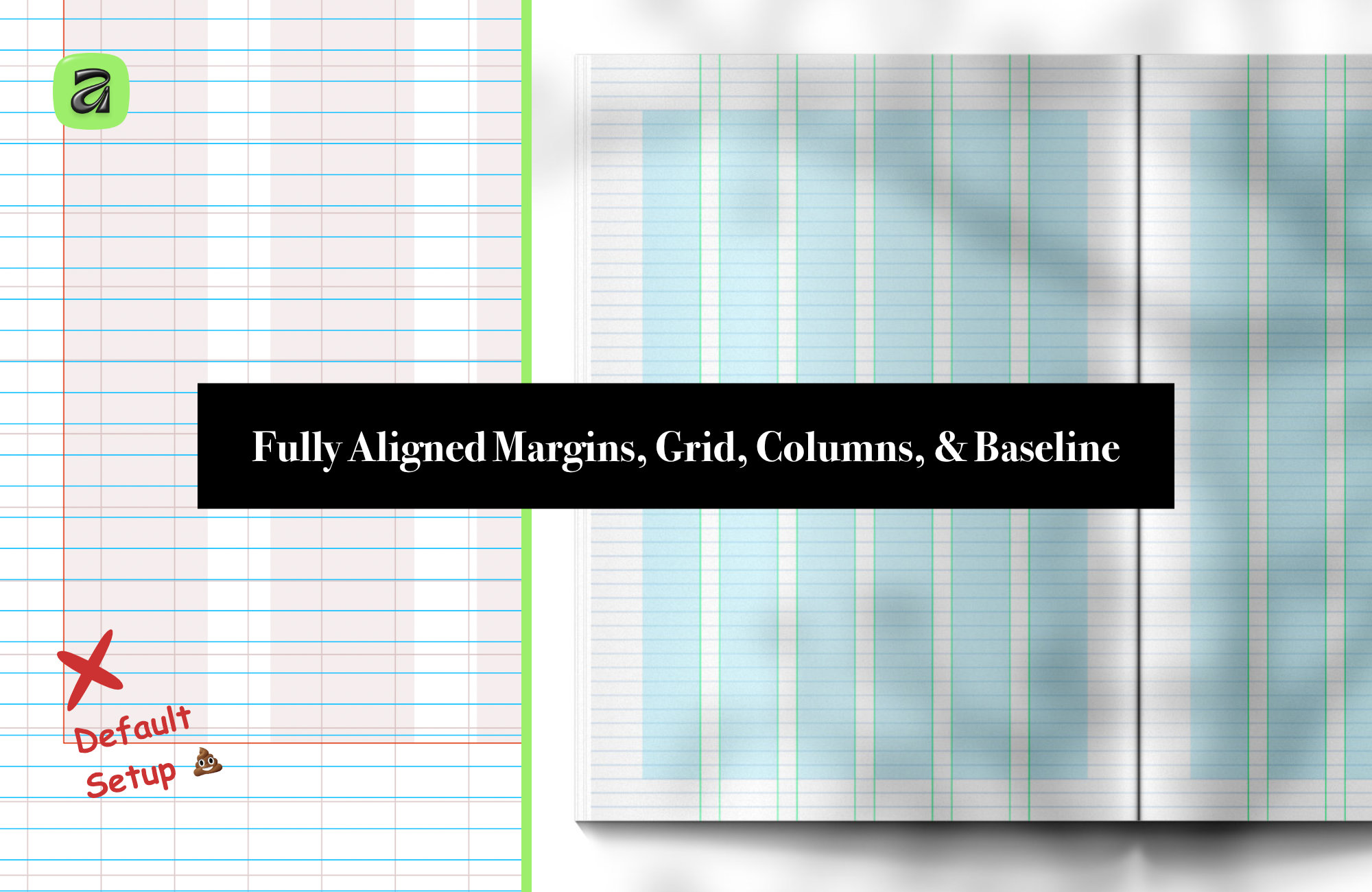
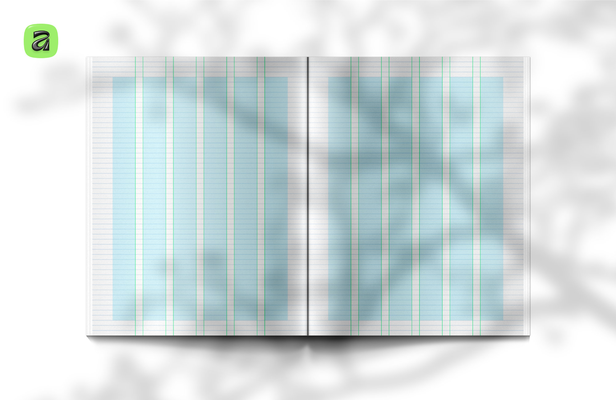
- Document setup with configured margins, bleed, and column grids
- 6-column and 12-column modular layouts
- Baseline rhythm system for consistent vertical spacing
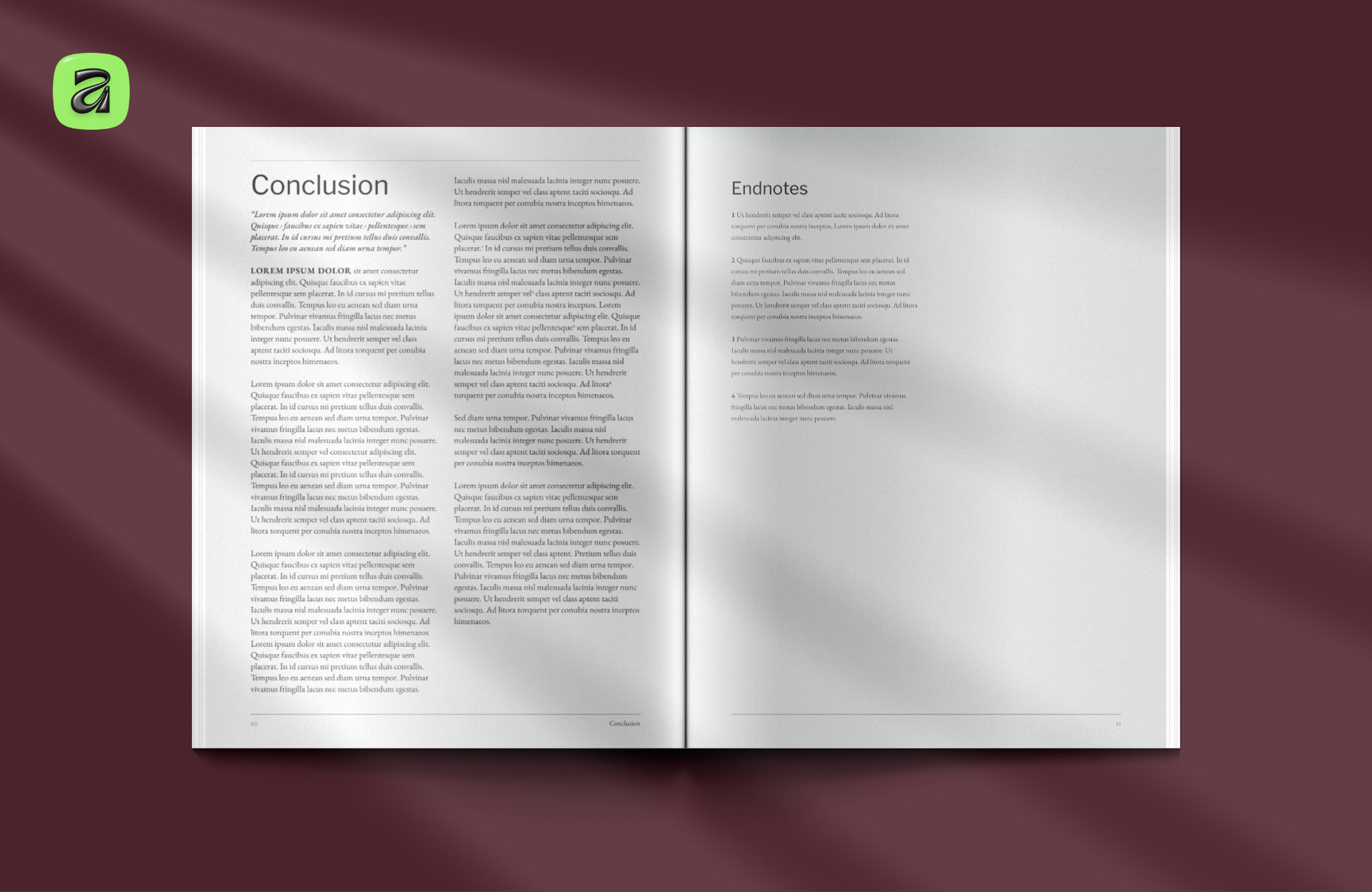
- Master pages for cover, section openers, body, and data layouts
- Complete typographic hierarchy — headings, body, captions, quotes, notes
- Tables and structured data layouts
It is intentionally restrained visually. Designed to adapt rather than impose a fixed style. Reports, white papers, academic documents, internal publications, or more advanced editorial layouts can all grow from the same foundation.
Built from real publication work
A lot of the setup came from years of working on real publications and refining the same core systems repeatedly: baseline grids, aligned spacing, reusable master pages, scalable hierarchy, and predictable layout behaviour across long documents.
In many ways it is less a template and more what starting a new publication probably should have looked like in the first place.
If you'd like to explore the system, both formats are available on Creative Market:
→ A4 Publication System for Affinity
→ Letter Publication System for Affinity
Mockups

