
Updated Feb 2026 (Originally published Dec 2016)
My typical website design process has three key stages: 1) Consultancy, 2) Design, and 3) Development. This post dives into stage two: the seven-step visual design process. By now, your consultancy package is signed off, including briefs, wireframes, prototypes, specs, budgets, and timelines. So, how do you start step two and get in the right mindset?
This approach works for most of my projects. If you’re still figuring out how to tackle every project from scratch, this might help. Pick and tweak what works for you.
1. Fear of the Blank Page: Where to Begin?
A structured process helps beat the dreaded blank page.
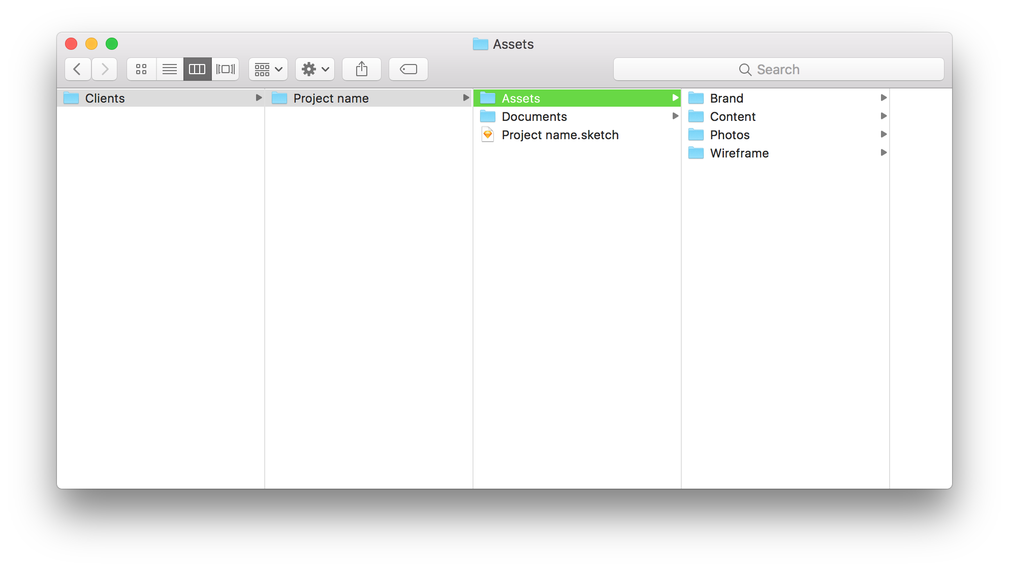
Start by getting organized. Set up a project folder with a subfolder for “Assets” to store wireframes, briefs, guidelines, images, content, and graphics. It’ll save you time later.
Read the brief carefully. Pay attention to the look and feel your client wants. Note likes, dislikes, potential colours, fonts, imagery, and overall style. Know your primary direction, and think of a backup idea in case there’s flexibility.
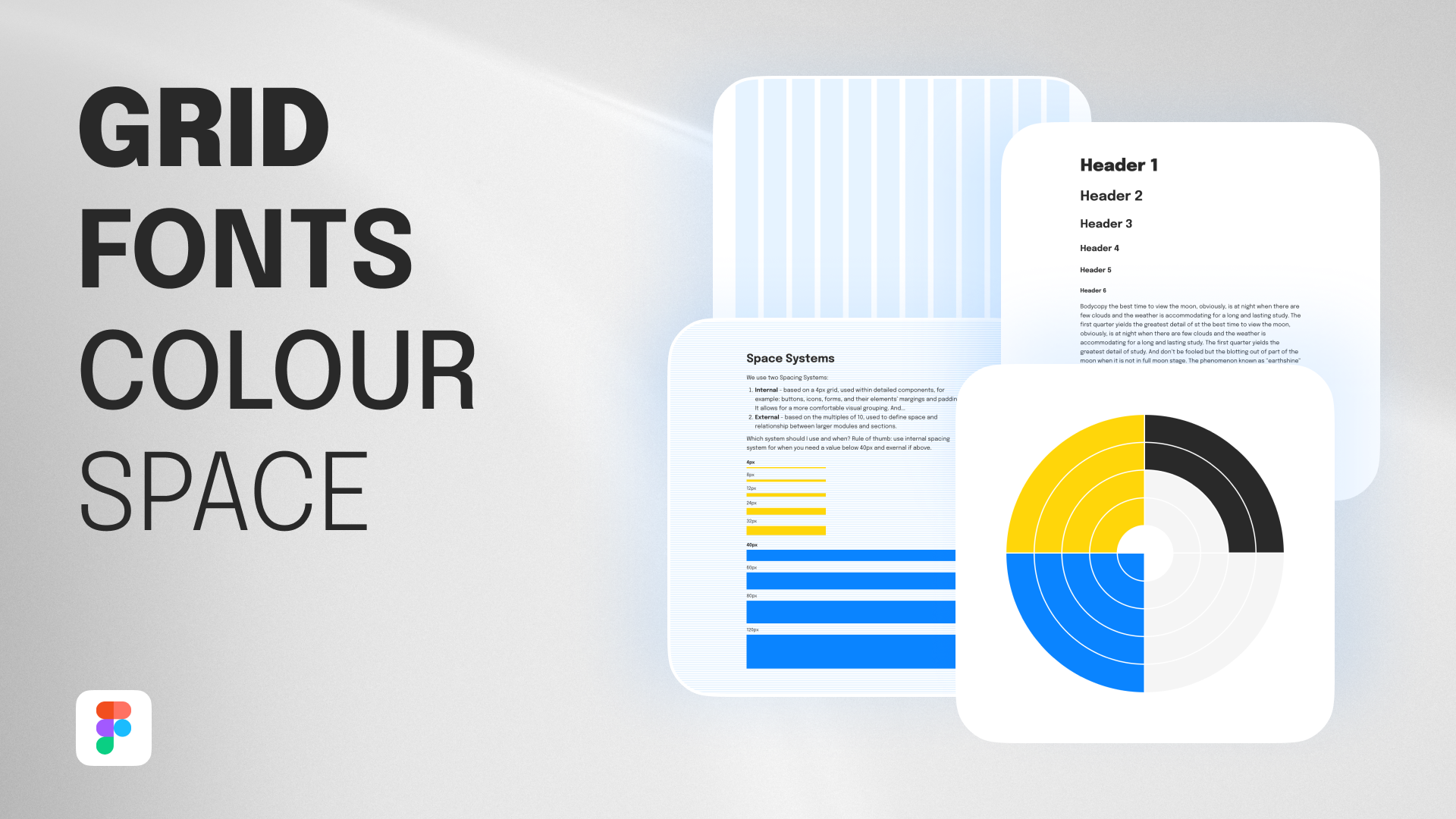
2. Set Your Mobile & Desktop Grids
Grids keep your design aligned with the final website. I usually stick to a 12-column desktop grid and a 4-columns mobile grid. Most developers I work with use this setup.
Some projects call for a custom grid for a more premium feel. That takes more time and budget, so make sure your client and developers are aligned. When in doubt, keep it simple.
3. Typography
Typography is the backbone of your design. Clear type ensures your message gets across. Everything else—colors, visuals, brand flair—should support the content, not compete with it.
Check if the client requires specific fonts and make sure they have a web license. If they’re open to new fonts, explore Google Fonts or Typekit for combinations that fit the brief.
Setting the Type
Connecting typography with code can be tricky. I use Type Scale for simpler projects or Modular Scale for bigger ones. Take screenshots and recreate them in Figma.
Grab my free starter templates for Figma. Pick fonts, update styles, and follow the scale to keep typography consistent and developer-friendly.
Keep font styles minimal. Only add new styles when necessary. Typically, I have styles for h1–h6, paragraphs, quotes, captions, and inverted/dark background variations.
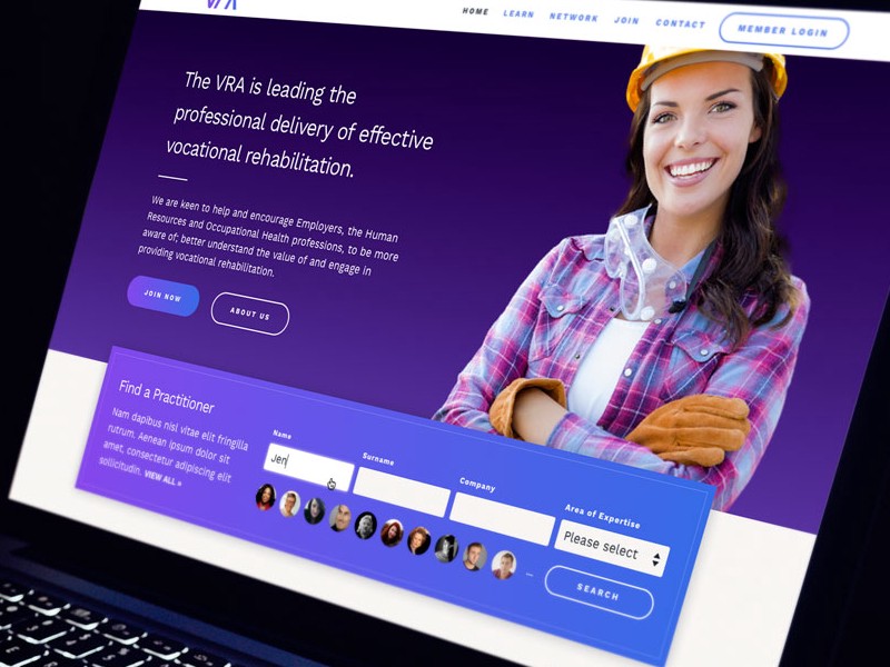
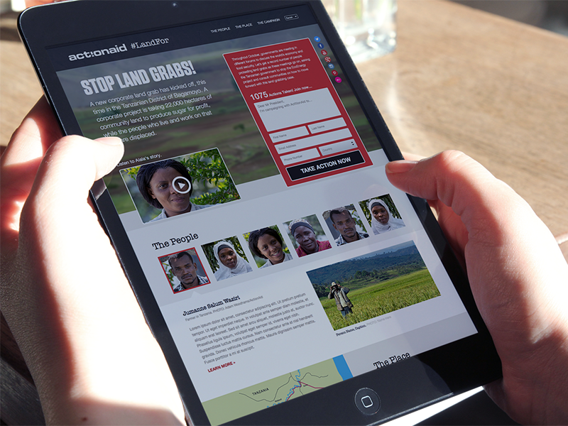
4. Logo, Colours, and Other Design Assets
Check the creative brief and brand guidelines again. Review the client’s website, competitors, and any inspirational material.
Browse Behance and Dribbble for visual cues that match your project’s vibe.
Gather logos, colours, fonts, illustrations, icons, images, messages, USPs, and tone of voice.
Lay everything on your canvas and experiment with combinations that answer the brief creatively.
5. Working Fast
Now it’s time to flesh out the wireframe. You don’t need to go header-to-footer. Start where the ideas are strongest. Present key content first, then build around it. Mix type, imagery, and colors. Refine, rinse, repeat.
Don’t overcomplicate small details that slow development. Focus on impact with minimal effort.
Use your budget wisely. Spend time on the key feature, not tiny details. Deliver a meaningful design first, then explore the extras.
6. Presenting Your Design
How you present your design matters. Face-to-face is ideal, but if not, use the tool that allows you to share your screen. Explain how your design solves the brief. Don’t just drop a folder of files on your client. A follow up with a working prototype in Figma for comments would be great as well.
7. Design Handover
The importance of the design-to-development meeting can’t be overstated. If someone else rather will code your design, make sure they have time to go through each screen, ask questions, and get answers.
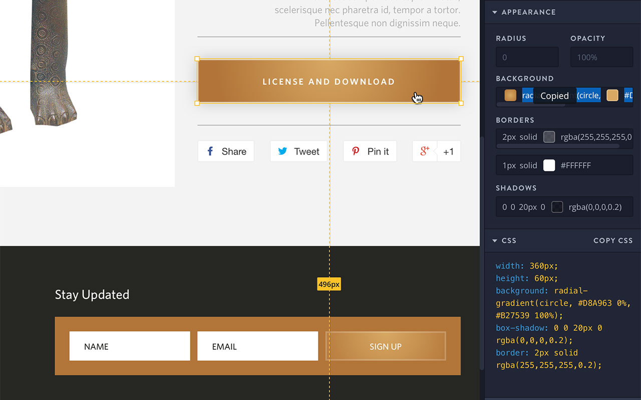
Inspect with Figma Dev Mode
Since originally writing about design‑to‑development workflows, tools have evolved significantly. Today, Figma Dev Mode provides a seamless bridge between design and development.
Dev Mode allows developers to access design files directly in the browser — no separate design software required. They can inspect components, view spacing and layout measurements, access colour variables and typography styles, and copy clean, production‑ready CSS or platform‑specific code snippets (including iOS and Android values).
Developers can also download assets in the required formats and resolutions, all within the same environment.
Because everything lives in a shared, cloud-based file, there’s no need to send updated design files back and forth. No more:
- “Can you send me the latest file?”
- “Is this the final version?”
- “The spacing looks different on my side…”
Working from a single source of truth reduces friction, saves time, and minimises version-control issues for both designers and engineers.
I highly recommend having Dev Mode open during design reviews or handoff meetings. Reviewing components, variables, and layouts together ensures alignment and speeds up implementation.
Also note that, during the handover meeting, it is inevitable that a few things will come up that might have to be tweaked in your design files such as: design consistency and UX errors, technical solutions available, and budget constraints.
Conclusion
Most of the actual design work happens at step 5. Don’t skip ahead—jumping forward usually means going back, wasting time, budget, and causing frustration. Follow the steps in order to keep things smooth for you and your client.
When faced with a blank canvas, stay calm. Take it one step at a time. After repeating this process, you’ll find your rhythm, leaving space for creative deviations and improvements while nailing the basics first.