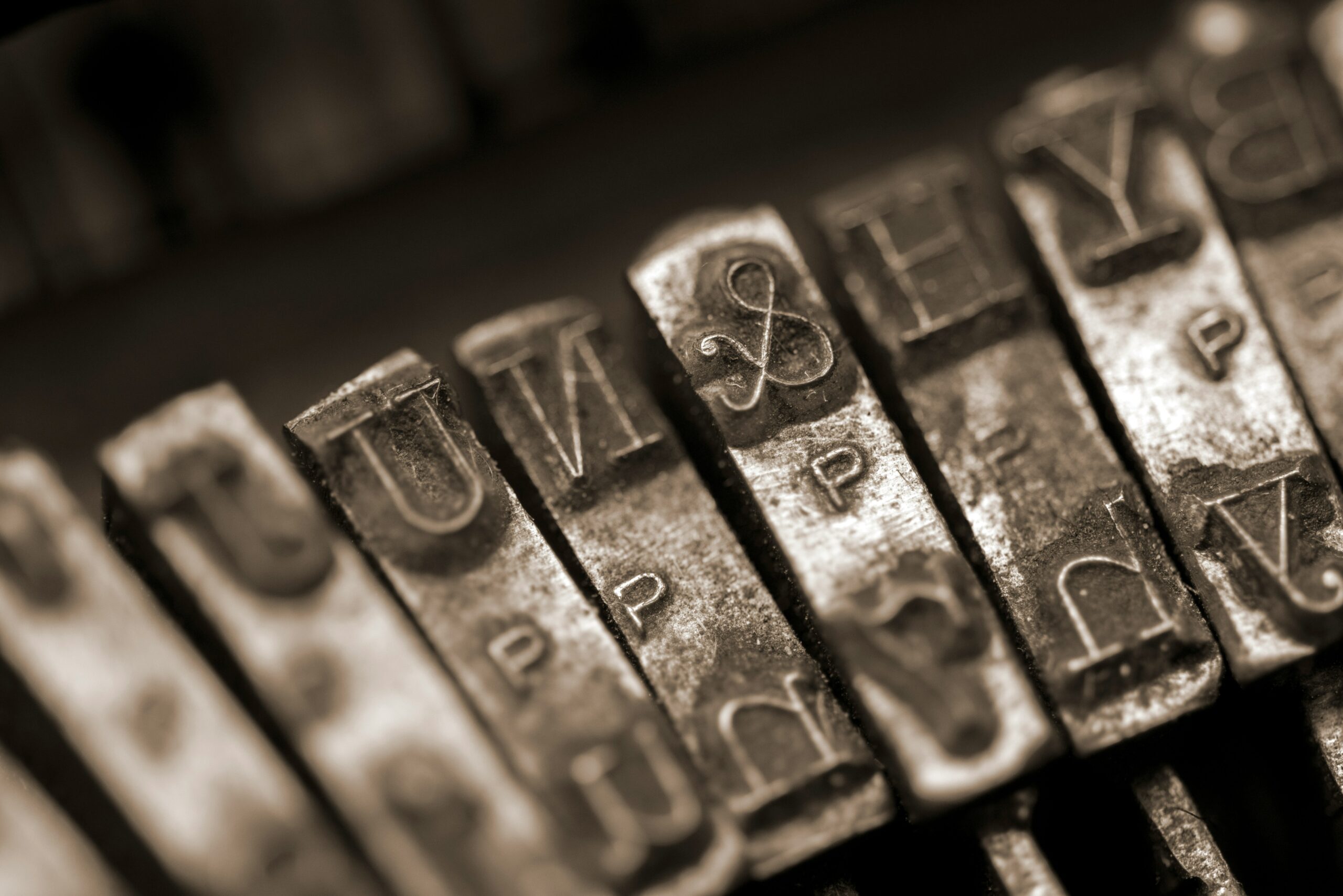
Photo by Shaun Bell on Unsplash
Correct typesetting is invisible. Incorrect isn't.
There's a version of this you've definitely seen. A webpage where the quotes look like this: "straight". Where a dash is just a hyphen. Where a degree symbol is the letters deg in brackets. It reads slightly wrong — you might not immediately know why, but you feel it.
The fix is simple.
Every piece of text published anywhere should be typeset. Not designed — typeset. Enriched, in the most literal sense. The raw characters that come out of a keyboard are placeholders. The correct ones have names and meanings and correct codes.
Quotes
English uses curly or slanted quotes (depending on a font style). Opening and closing, distinct from each other. Double quotes for speech, single quotes for a quote within a quote:
| She said, “I’ll be back by six.” |
| She said, “He called it ‘a complete disaster’ and left.” |
What you must never use are straight marks — those are inch and foot symbols.
| 6" (six inches) |
| 5' (five feet) |
The dash is not the hyphen
A hyphen connects. A dash interrupts — or separates a clause. They are not the same character and should not be used interchangeably.
The em dash (—) is what you want in prose. It's longer. It has weight. The en dash (–) has its own uses, particularly in ranges. Neither is the little - on your keyboard.
| Wrong | Right |
|---|---|
| She arrived at the station - the last train had already gone. | She arrived at the station — the last train had already gone. |
Symbols
Don't approximate them. A (C) is not a ©. A (R) is not a ®. Use the actual character — it exists, it has a code, and it takes about three seconds to find.
| Wrong | Right |
|---|---|
| (C) 2026 A. N. Other (R) | © 2026 A. N. Other® |
| Quick reference | ||
|---|---|---|
© |
© | Copyright |
® |
® | Registered trademark |
™ |
™ | Trademark |
° |
° | Degree |
– |
– | En dash |
— |
— | Em dash |
− |
− | Minus sign |
± |
± | Plus-minus |
§ |
§ | Section sign |
• |
• | Bullet |
Non-breaking spaces are invisible and important.
A browser doesn't know that “451 °F” shouldn't be split across two lines. It doesn't know that a single-letter word stranded at the end of a sentence looks wrong. You have to tell it — with [ ] between the characters that belong together.
The em dash is a particular case. It should stay with the word before it, never kick it to the start of a new line alone.
A typeset example of what all of this looks like in practice:
When Mr Pickwick observed in the morning edition (The Eatanswill Gazette № 12) the advertisement for Dr Slammer's Restorative Tonic®, he could scarcely credit it — the recommended dose was ±2 °F above the body's natural temperature, administered no fewer than 3½ times daily.
That's it. It just reads right.
The goal isn't pedantry. It's the same thing it always is in typography — that the reader moves through the text without anything snagging. Correct typesetting creates unnecessary drag.
If you’re laying out a publication and want the typographic foundations handled from the start — spacing, hierarchy, grid, all of it — I built a system for exactly that.
Available on Creative Market:
→ A4 Publication System for Affinity
→ Letter Publication System for Affinity